
Another test data release day has come and gone, in its wake a dust cloud of emotion falling to the ground, impervious to the damage breathed in by otherwise committed and caring people. I have seen this play out year after year, myself a victim of the pressure to put everything on hold and stare at the numbers as if they hold some secret code to a school utopia. Professionally, I’m a reform act (KERA) baby so this is all I’ve ever known. I call it “Hanging Day” and after 25 years of drying tears or inflating balloons, I feel as though I have earned the right to call it anything I please. Someday, I’ll look back and, not so fondly, remember Hanging Day and how some people hung banners and some hung their heads. And although my opinion is that both reactions are mostly misguided given that they legitimize a faulty system, this isn’t a criticism of my colleagues or our support personnel at the state department. I’ve responded both ways, multiple times, even though I know better. In many respects, I’m not sure we have a choice. The embedded, veiled competition of the system makes us behave in a manner antithetical to our core beliefs.
For reasons I have yet to identify, this year’s release felt a little different. Maybe it was the unknowns of the new system, maybe it was the anxiety of potential community perceptions, or maybe I just question the motives of a governor whose words run contradictory to his actions and who has a newly minted ability to saturate the state board of education with privatization advocates. I know, I know…this accountability system, and the (ridiculousness of) applying a single grade to a school, is supposed to function as a conversation starter, and who wouldn’t want that? The notion of student-centered conversation evokes wonderful imagery and appeals to the masses. The problem is that the conversation began long ago…before this latest iteration of accountability, before rewards and labels, before most of us even earned our degrees. It’s what teachers do. To insinuate otherwise is a slight to the profession.
Prior to the release of the data, and in the immediate aftermath, the role of poverty was at the center of many of the “achievement” conversations. Depending on your political leanings, the idea that low income students are at a disadvantage is either an issue to be dealt with in the quest for higher test scores or a built-in excuse levied by incompetent educators who are comfortable with the status quo. I have heard both from educated individuals. However, in fairness, I believe most do not view the issue as being this dichotomous, acknowledging the role poverty plays in student progress but not relegating that progress to a forgone conclusion. And that’s where this argument begins…the ill-advised questions we ask in response to the bulk of information at our disposal and the knowledge that X or Y school “scored” more or less than us.
Before I continue, it is important to note that I do not believe student achievement or learning is synonymous with test scores or a holistic accountability score. No matter how you frame it or manipulate the weights, the introduction of a scorecard makes this a game, and games have been/are/will be played. For schools to have the ability to call a 15-year-old child “transition (career) ready” because he passes a Microsoft office certification exam is disingenuous, further emphasizing that in our pursuit of better scores we lose sight of the proper questions we should be asking.
I have spent way too much time reading the media coverage over the last week, along with the accompanying back-and-forth in the abyss of social media. I should know better, but there’s always an insightful nugget hidden within the vitriol that keeps me engaged. My shortcomings aside, it was the graph below, published in the Courier Journal, that made me begin to think differently about the data.
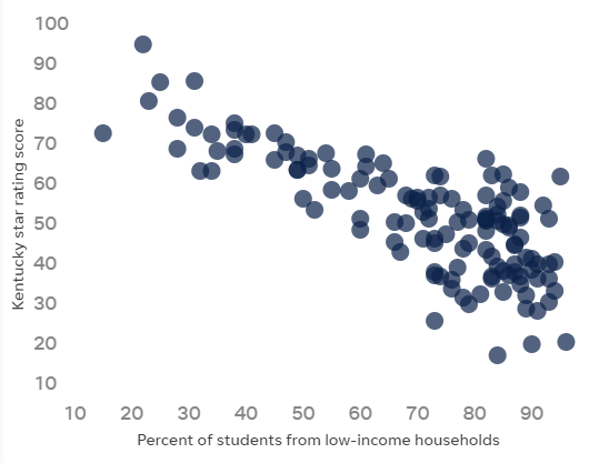
Based on every school in Jefferson County Public Schools, this scatter plot shows the relationship between family income and the school’s overall score in this year’s accountability model. In short, the higher the percentage of low-income students, the lower the score. Conversely, those schools with a low percentage of low-income students tend to score higher. This isn’t new, and research has consistently found these same results when income is coupled with “achievement” testing, including the ACT and SAT.

What struck me about this particular scatter plot was the comet-shaped result, with a more bulbous array at the end with a higher percentage of low-income/lower scoring schools and a tighter array at the end with a lower percentage of low-income/higher scoring schools. I wondered if the shape was a coincidence, and I couldn’t stop thinking about how the aforementioned head-hangers wished they landed on the comet’s tail. Anyway, I looked up the anatomy of a comet. Turns out, I was mostly correct about comet shape, with the larger end called the nucleus and the thin end called the ion tail. The “eye on” pun wasn’t lost on me as I knew there was something remarkable about the schools scoring in what was the tail of the comet.
Not satisfied with the JCPS chart, I wondered if the same scenario would play out in Northern Kentucky. I went digging. I mined the database for all schools in our local cooperative, using the percentage of disadvantaged students and the overall accountability score from the school report card dashboard. After a quick refresher in excel, the data were entered and a scatter plot emerged. Again, this was every elementary, middle, and high school from the 17 Northern Kentucky Cooperative for Educational Services member districts. This included five county districts and 12 independent districts.

While not as defined as the JCPS plot, the comet shape was still noticeable. The primary difference in the two plots, other than the sheer number of schools, is that there is a large cluster of Northern Kentucky schools with a 40% to 50% disadvantaged student population as compared to the cluster of 70% to 90% in JCPS. Wanting additional analysis, I added a line of best fit, and this is when a clearer understanding began to materialize.
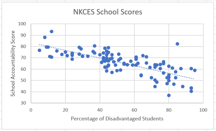
Dividing the data points into thirds for conversation (5%-35% disadvantaged, 35%-65% disadvantaged, and 65%-95% disadvantaged), the variance in the data points were telling a story. There was greater variance in the nucleus of the comet (65%-95% disadvantaged) as compared to the middle of the comet and the comet’s tail. Meaning, excluding outliers, the data points were closer to the line of best fit in the middle and tail. While I already know that a low disadvantaged percentage is correlated to a higher score, what this also told me was that the lower the percentage of disadvantaged students, the more predictable the score would be.
Noticing these patterns, I reflected on the responses I have heard over the years. How do we typically respond to these data? To that end, I created an annotated version of the NKCES member district scatter plot for further discussion. The vertical lines highlight the previously mentioned natural clusters of percentage of low-income students and the horizontal line is affixed close to both the mean score (65.4) and the median score (66.4)

Let’s begin with an all-too-common scenario using School #3 in section D. It goes like this: The accountability scores come in, there is a period of disbelief and defeat along with high levels of embarrassment for a few days, then some bright spots are identified within the darkness, and not long after, teachers and administrators remind each other that the work continues. Sound familiar? These professionals look for solutions in the data and try to find answers to questions the system creates, disregarding their pedagogical acumen in the hunt for higher scores. They eventually ask, “What is School #2 doing that we aren’t?” or even worse, “How is School #1 able to do this given their free and reduced population?” This same scenario could play out with School #5 asking these questions about School #4, or in any situation where there are two schools with similar demographics. These are the WRONG questions. This leads to a vicious, but well-intentioned cycle of visiting these “higher scoring” schools, purchasing programs that other schools use, and lining the pockets of for-profit testing companies who are all too willing to sell instructional resources “guaranteed to boost achievement.” Well, at least that’s what the neon pink sunburst sticker on the cover says. Notions of who we aren’t creates an endless stream of failed initiatives, low morale, and teacher turnover, all of which compound the difficult circumstances that already characterize schools in low-income neighborhoods.
Promoting this reach into the pot of fool’s gold are the conservative think tanks and education non-profits who pontificate ad nauseam about the causes of “failing” schools regardless of their collective (lack of) experience. Any school like School #1 in section C is held up as irrefutable proof that low-income students can “achieve” just like their well-heeled counterparts in high SES schools, fingers pointed toward the comet’s tail as the trophy to which we should all aspire. If those low-performing schools would just work a little harder and a whole lot smarter, they, too, can place an order at the print shop for a new banner. In fact, we’ve heard this rhetoric recently.
At the superintendent summit in September, a colleague questioned the governor on the decline of Kentucky’s education ranking during his tenure. Specifically, to what factors did he attribute the lower ranking. The governor offered these three tidbits of wisdom on school improvement:
- We need to hustle. (Educators don’t work hard enough.)
- We need to keep our eye on the ball. (Educators don’t care enough.)
- We need to dust off our gemstones. (Educators aren’t smart enough.)
I can’t speak for everyone in the room, but, how could the state’s schools go wrong with that blueprint? I mean, bootstraps are there for a reason, right? Flanked by our commissioner and one of the more vocal members of the state board, this message was tinged with themes, both blatant and furtive, that “achievement” was something earned by those willing to do the difficult work. For the governor to espouse meritocratic ideology in a room full of educators who continually must pursue moving targets felt disappointingly unmindful.
Listen, NOBODY I know is saying low-income children can’t learn at high levels. NOBODY. But comparing accountability results of schools and districts, even with the growth factor included, is akin to comparing 100 meter run times where the wealthiest students get a three-second head start. Again, this doesn’t mean low income children can’t do well and it doesn’t mean high-income students can’t do poorly. However, it does mean that wealth will win out over a large sample size. And, ultimately, it causes otherwise strong educators to ask the wrong questions about school improvement. Yes, tweaks to curriculum and assessment can yield incremental gains, but lasting, long-term improvement comes from an entirely different focus. If we continue to chase the comet’s tail with changes directed only at instructional programs, we will never realize full-scale advancement.
By continually asking what high-scoring schools are doing and then trying to modify our own practice to emulate those targets, we perpetuate a fallacy that the best educators conspired to migrate as a herd of pedagogical unicorns and settle in, shockingly, high SES schools. Schools full of financially stable families do not have a monopoly on effective instruction; they have the ability to avoid asking the wrong questions because their highly predictable results reside comfortably in the comet’s tail. Further, the system doesn’t apply the same pressures to these schools as they naturally elude the image-damning labels affixed to their lower-scoring neighbors.
So, what are the right questions? To discuss, let’s return to the NKCES scatter plot with the annotations and give special attention to the six distinct sections of the graph.
For far too long we have asked ourselves how to get a school in section D to score in section C or a school in section E to score in section B. Granted, this isn’t the exact conversation in schools because these sections are in place for this argument, but the point is obvious. Schools are trying to move vertically given their percentage of low-income students in an effort to be the horizontal equivalent of those schools whose low percentage of low-income students allows them to naturally score in the comet’s tail, or section A.
Before anyone gets heightened by that last sentence, I am not insinuating that teachers of higher-income students don’t have to work as hard. They do. I know because I was a teacher and principal in one of those schools. They work incredibly hard at honing their craft. However, they have much fewer external influences that would be considered barriers to the learning process. Therefore, the question is not a matter of what is happening in sections A, B, or C that sections D and E can emulate. The question we should all be asking is: What is NOT happening in section F?
After looking at multiple analyses, I could not find a single example of a school with a low percentage of low-income students that scored holistically poorly in state accountability measures. How is this possible? Are we all to believe the unicorn herd theory? How about the monopoly theory? Or are we all comfortable accepting that maybe…just maybe…these accountability measures have validity issues and we don’t care? Well, I care. I care because kids and families and communities deserve better than to be labeled by a flawed system. Yes, I see the outlier in section C but where is the outlier in section F?
What is NOT happening in section F?
If we are truly committed to student growth, including academic, vocational, social, and emotional, relentlessly pursuing the answer to this question could unlock the mystery of school improvement. Decades ago, researchers concluded that income and score are related. Today, it is incumbent upon educators to go deeper than just accepting this as reality. Relegating our data to poverty byproduct status or throwing out a #poverty in our social media posts to make ourselves feel informed is never going to generate profound conversation or progress. We must unearth the meaning of an empty section F by quarrying the hidden recesses of income inequity.
The blank space in the scatter plot serves as a microcosmic reminder of the uncomfortable challenges facing a larger world, revealing that even highly structured and regulated social constructs like public education are not immune to economic hierarchies. Whether school reflects society or vice versa has been debated endlessly but I’m not sure it even matters. By forcing ourselves into uncomfortable conversations, we make human those who have been forced to live in the margins. Are we willing to be disturbed by examining and assessing our own value systems?
Poverty is much too sizable a concept on which to pin education’s woes. However, the hundreds of tangents to poverty have been documented. That we continue to largely ignore the findings, or that we fail to summarily prioritize our funding based on the research, speaks to gross political decision-making from our legislators at both the federal and state levels. Perhaps if we were less interested in how our 3rd graders perform on a math exam as compared to same-age peers in Singapore or Norway and more with equitable experiences of all American children, the comparison would most likely render itself moot anyway. Of course, that means we have to maximize the impact of available resources by revisiting our funding models and allocation formulas. We can no longer pretend to value diversity if we continue to reward homogeneity.
Teaching and learning is our business. In its simplest form, our mission is to take individual children, assess their strengths and weaknesses, then tailor an experience to foster growth. By focusing solely on academic components, we will continue to realize the same results we’ve always gotten. But…What is NOT happening in section F? In this void are the distressing topics we like to sidestep in an effort to preserve our individual Mayberrys. This out of sight, out of mind mindset is no more productive than the separate but equal doctrine of a century ago. And I’ll leave predictions to the futurists, but, economic disparity may be the impetus for the next wave of civil rights advocacy in our nation.
If our kids matter, and I know they do, we must illuminate the shadows of food insecurity and inadequate healthcare; search for innovative solutions to affordable housing and homelessness; and hold legislators, and ourselves, to a higher ethical standard that rejects political backscratching and the use of public education as a pawn. Interested in a study of your own? Compare attendance rates and accountability scores. My guess is that you will find all the evidence you need to underscore the importance of the first sentence of this paragraph. THIS is the blank space is section F. To critics, this probably seems a little too fuzzy, a little too pie-in-the-sky, and, dare I say, a little too non-competitive. Nevertheless, my motive is to improve the lives of children, not to, in any way, take from those who are considered the “haves.” I want ALL of our kids to be “haves.” By focusing on mitigating the effects of adverse childhood experiences, my hunch is that the gains we’ve been pursuing for the last 30 years will come a little more easily.
This brings me back to our new accountability system over which I have spent an inordinate amount of emotional energy. There is a price tag on everything, but I envision a world where we address whole-child initiatives and spend considerably less on a test that has little to no positive impact on real learning or achievement. How much are we spending on the test? That’s a question I’ve tried to answer by scouring the KDE website and using every possible combination of words in a search engine. In 2012, the state awarded a $58,000,000 contract for testing services. Despite repeated attempts, I could find no dollar amount attached to the 2018 contract, only a mention of the vendor under the assessment tab on the KDE website. I do few things very well, but I am a 100 point, AYP-satisfying, CCR-accomplished, 5-star, Google-er of Distinction…and I can’t find it. For as much as “transparency” has become a buzzword under our current Kentucky Board of Education, I am baffled as to why I have been unable to gather this information. $58,000,000 isn’t the answer, and I am not advocating for blank checks to be thrown at school districts, but those dollars could have a considerable positive effect on our children as opposed to the off-the-shelf sorting mechanism it buys now. Yes, I am acutely aware that the Every Student Succeeds Act requires testing, but I’ve yet to read anything about selling our souls or bequeathing our life savings to Pearson.
Our state is full of the smartest, most accomplished educators on the planet. If we free them up and provide them the resources to address the barriers associated with section F, school would become a better avenue for all kids to become the best versions of self. There would be no comet’s tail, only a horizontal, oblong shape of similarly high “achieving” schools that are better equipped to confront the deficits created by income disparity. This revamped scatter plot would most likely look like a burrito and who doesn’t love burritos? Let’s chase that instead.
